Tabs Section
The Tabs Section is positioned below the Title Bar, below the Navigation Section, above the plugin screen and contains buttons that route to other tab contents toggling the data presented.
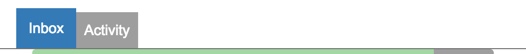
The sample below shows an example of tab navigation of the inbox plugin. The ‘Inbox’ is presented as the active tab and the ‘Activity’ is presented as the inactive tab.
The Tabs Section serves as screen content control.
If a Tabs Section is required it is constructed by the plugin screen.
The buttons remain a fixed size throughout a responsive lifecycle. The buttons are sized around the text they contain. The active tab button uses the primary colour styling and is slightly taller than the selectable inactive tab button.
Note
The buttons require a different theme to the Title Bar and generic peek theme buttons.
Classes
The .peek-tabs-section class contains the looks classes specific to the
Tabs Section.
.peek-tabs-section {
  /* Contains the Tabs Section attributes */
      ...

  .btn-group {
    /* Contains the attributes unique to the Tabs Section */

    .tabs-section-btn {
      /* Contains the Button attributes unique to the Tabs Section */

          ...

    }
    .tabs-section-btn.active {
      /* Contains the Button attributes for the active tab unique to the Tabs Section */
          ...

    }
    .tabs-section-btn-divider {
      /* Contains the button divider attributes unique to the Tabs Section */
          ...

    }
    .tabs-section-btn-disabled {
      /* Contains the button disabled attributes unique to the Tabs Section */
          ...

    }
  }
}

.peek-tabs-bar-padding {
  /* Provides padding for the screen under the Tabs Section */
      ...

}
SCSS Files
The Tabs Section style classes are found in the
_tabs_section.scss.
The Tabs Section HTML layout classes are found in the
_tabs_section.web.scss.
The Tabs Section NativeScript layout classes are found in the
_tabs_section.ns.scss.
HTML
The peek-tabs-section is to be included before the code of the plugin screen
requiring Tabs.
The tabs-section-btn-divider and tabs-section-btn-disabled classes are not required in the Web app.
Their attributes are handled by pseudo-selectors of tabs-section-btn.
<div class="peek-tabs-section">
    <div class="btn-group" role="group">
        <Button class="tabs-section-btn"
                [class.active]="barIndex == 0"
                (click)="barIndex = 0">
            Inbox
        </Button>
        <Button class="tabs-section-btn"
                [class.active]="barIndex == 1"
                (click)="barIndex = 1">
            Activity
        </Button>
    </div>
</div>
NativeScript
The peek-tabs-section is to be included before the code of the plugin screen
requiring Tabs.
The tabs-section-btn-divider and tabs-section-btn-disabled classes are required in the
NativeScript app. Pseudo-selectors applied in the SCSS are not supported by NativeScript.
tabs-section-btn-divider will set the right side border of the button.
tabs-section-btn-disabled applies the disabled styling.
<StackLayout class="peek-tabs-section">
    <GridLayout class="btn-group" rows="auto" columns="auto, auto, *">
        <Button row="0" col="0"
                class="tabs-section-btn"
                [class.active]="barIndex == 0"
                text="Inbox"
                (tap)="barIndex = 0"></Button>
        <Button row="0" col="1"
                class="tabs-section-btn"
                [class.active]="barIndex == 1"
                text="Activity"
                (tap)="barIndex = 1"></Button>
    </GridLayout>
</StackLayout>