Tables Section
The Tables Section is best suited when there’s logical relationships among text, numbers, images, or other data exist in two dimensions (vertical and horizontal). These relationships are represented in columns and rows, and the columns and rows must be recognizable in order for the logical relationships to be perceived.
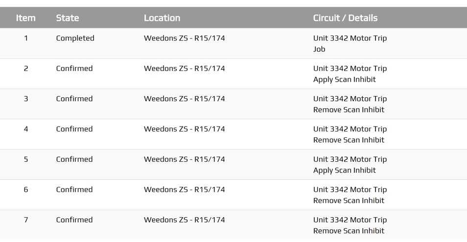
Useful for viewing detailed data and precise values, good for comparing individual values.
The objective of this technique is to present tabular information in a way that preserves relationships within the information.
- Filter or sort data
- Show exact data
- Visualise single or two dimensional data.
Any plugin Screen will be able to use the .peek-tables-section attributes.
Classes
The .peek-tables-section class contain the classes specific to a Tables
Section.
.peek-tables-section{
/* Contains the Tables Section classes */
  ...

  .table{
  /* Contains the table attributes unique to the Tables Section */
    ...
  }

  .tr{
  /* Contains the table row attributes unique to the .table class */
    ...

  }
  .th{
  /* Contains the table head cell attributes unique to the .table class */
    ...

  }
  .td{
  /* Contains the table row cell attributes unique to the .table class */
    ...

  }

  .bg-odd {
  /*
    Applies the table even rows background theme
    This class also exists inside the .bg-... classes found in :ref:`other_useful_styles`.
  */
      ...

  }
}
SCSS Files
The Tables style classes are found in the
_tables_section.scss.
The Tables Section HTML layout classes are found in the
_tables_section.web.scss.
The Tables Section NativeScript layout classes are found in the
_tables_section.ns.scss.
HTML
The Tables Section uses Bootstraps Tables.
Below is the HTML code extract of table header and two rows from Tables Section:
<div class="peek-tables-section">
    <table class="table">
        <thead>
        <tr class="tr">
            <th class="th">ID</th>
            <th class="th">Name</th>
            <th class="th">Scheduled Date</th>
            <th class="th">Status</th>
        </tr>
        </thead>
        <tbody>
        <tr class="tr"
            *ngFor="let item of incidents; odd as odd"
            [class.bg-primary]="item.fieldStatus.isActive"
            [class.bg-warning]="item.fieldStatus.isDispatched"
            [class.bg-success]="item.fieldStatus.isAccepted"
            (click)="jobClicked(item)">
            <td class="td"
                [class.bg-odd]="odd" [class.bg-even]="even">
                {{item.jobNumber}}

            </td>
            <td class="td"
                [class.bg-odd]="odd" [class.bg-even]="even">
                {{item.jobName}}

            </td>
            <td class="td"
                [class.bg-odd]="odd" [class.bg-even]="even">
                {{item.scheduledDate
                | date:'HH:mm EE dd-MMM'}}

            </td>
            <td class="td"
                [class.bg-odd]="odd" [class.bg-even]="even">
                {{item.fieldStatus.niceName}}

            </td>
        </tr>
        </tbody>
    </table>
</div>
NativeScript
The Tables Section uses Listview.
Below is the NativeScript code extract of table header and two rows from Tables Section:
<StackLayout class="peek-tables-section">
    <StackLayout class="table">
        <GridLayout rows="auto" columns="2*, 3*, 2*">
            <Label class="th" row="0" col="0" text="Job"></Label>
            <Label class="th" row="0" col="1" text="Scheduled"></Label>
            <Label class="th" row="0" col="2" text="Status"></Label>
        </GridLayout>

        <GridLayout rows="*" columns="*">
            <ListView [items]="jobs">
                <ng-template let-item="item" let-i="index" let-odd="odd" let-even="even">
                    <StackLayout
                            [class.bg-primary]="item.fieldStatus.isActive"
                            [class.bg-info]="item.fieldStatus.isAccepted"
                            [class.bg-success]="item.fieldStatus.isDispatched"
                            (tap)="jobClicked(item)">
                        <GridLayout rows="2*,2*,*" columns="2*, 3*, 2*"
                                    class="tr"
                                    [class.bg-odd]="odd" [class.bg-even]="even">
                            <!-- Details -->
                            <Label row="0" col="0"
                                   class="td"
                                   [text]="item.jobNumber"></Label>
                            <Label row="0" col="1"
                                   class="td"
                                   [text]="item.scheduledDate | date:'HH:mm EE dd-MMM'"></Label>
                            <Label row="0" col="2"
                                   class="td"
                                   [text]="item.fieldStatus.niceName"></Label>
                            <!-- Description -->
                            <Label row="1" col="0" colSpan="3"
                                    class="td"
                                   [text]="item.jobName" textWrap="true"></Label>
                        </GridLayout>
                    </StackLayout>
                </ng-template>
            </ListView>
        </GridLayout>
    </StackLayout>
</StackLayout>
Note
For the ListView to fill the screen space it is required to be the child of a GridLayout. Star mode for GridLayout row and column means that child ListView will expand to fill the gap left from other elements in the screen.