Navigation Section
The Navigation Section is positioned below the Title Bar, above the plugin screen and contains buttons that route to other screens or toggle the data presented.
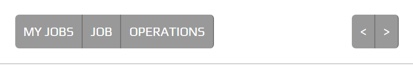
The sample below shows an example of breadcrumbs navigation (left) and forward / next and back / previous buttons (right).
The Navigation Section serves as primary navigation routes for the active plugin.
If a Navigation Section is required it is constructed by the plugin screen.
Navigation Types:
- Breadcrumbs
- Pagination
- forward and / or back, next and / or previous
The buttons remain a fixed size throughout a responsive lifecycle. The buttons are sized around the text they contain.
Note
The buttons require a different theme to the Title Bar and generic peek theme buttons.
Classes
The .peek-nav-section class contains the looks classes specific to the
Navigation Section.
//Peek navigation section
.peek-nav-section {
  /* Contains the Navigation Section attributes */
  ...

  .btn-group {
    /* Contains the attributes unique to the Navigation Section */
    ...

    .nav-section-btn {
      /* Contains the Button attributes unique to the Navigation Section */
      ...

      &:hover {
        /* pseudo-selectors are not supported in NativeScript */
        ...

      }

      &:last-child {
        /* pseudo-selectors are not supported in NativeScript */
        ...

      }

      &:first-child {
        /* pseudo-selectors are not supported in NativeScript */
        ...

      }

      &:first-child:last-child {
        /* pseudo-selectors are not supported in NativeScript */
       ...

      }

      &:disabled {
        /* pseudo-selectors are not supported in NativeScript */
        ...

      }
    }
    .nav-section-btn-divider {
      /* Contains the button divider attributes unique to the Navigation Section */
      ...

    }
    .nav-section-btn-disabled {
      /* Contains the button disabled attributes unique to the Navigation Section */
      ...

    }
  }
}

.peek-nav-bar-padding {
  /* Provides padding for the screen under the Navigation Section */
  ...

}
SCSS Files
The Navigation Section style classes are found in the
_navigation_section.scss.
The Navigation Section HTML layout classes are found in the
_navigation_section.web.scss.
The Navigation Section NativeScript layout classes are found in the
_navigation_section.ns.scss.
HTML
The peek-nav-section is to be included before the code of the plugin screen
requiring the Nav Bar.
The nav-section-btn-divider and nav-section-btn-disabled classes are not required in the Web app.
Their attributes are handled by pseudo-selectors of nav-section-btn.
<div class="peek-nav-section" *ngIf="!confirmDialogShown()">
    <!--
        The following 'div' groups button to the left of the Nav Bar.
        Can contain one to many buttons
    -->
    <div class="btn-group" role="group">
        <Button class="nav-section-btn"
                role="group"
                (click)="navToMyJobs()">
            My Jobs
        </Button>
        <Button class="nav-section-btn"
                role="group"
                (click)="navToJob()">
            Job
        </Button>
        <Button class="nav-section-btn"
                role="group"
                (click)="navToOperations()">
            Operations
        </Button>
    </div>

    <!--
        The following 'div' groups button to the right of the Nav Bar.
        Can contain one to many buttons
    -->
    <div class="btn-group pull-right"
         role="group">
        <button class="nav-section-btn"
                role="group"
                [disabled]="!lastOperationEnabled()"
                (click)="navToLastOperation()">
            <fa name="arrow-left"></fa>
        </button>
        <button class="nav-section-btn"
                role="group"
                [disabled]="!nextOperationEnabled()"
                (click)="navToNextOperation()">
            <fa name="arrow-right"></fa>
        </button>

        <!-- CONFIRM THE OPERATION -->
        <Button class="nav-section-btn"
                *ngIf="confirmEnabled()"
                (click)="confirmOp()">
            Confirm
        </Button>
    </div>
</div>

<div class="peek-nav-bar-padding">
<!-- This div provides padding for the screen under the Navigation Section -->

</div>
NativeScript
The peek-nav-section is to be included before the code of the plugin screen
requiring the Nav Bar.
The nav-section-btn-divider and nav-section-btn-disabled classes are required in the
NativeScript app. Pseudo-selectors applied in the SCSS are not supported by NativeScript.
nav-section-btn-divider will set the right side border of the button.
nav-section-btn-disabled applies the disabled styling.
<GridLayout class="peek-nav-section"
            rows="auto" columns="auto, *, auto"
            *ngIf="!confirmDialogShown()">
    <GridLayout class="btn-group"
                rows="auto" columns="auto, auto, auto, auto"
                row="0" col="0">
        <Button class="nav-section-btn nav-section-btn-divider"
                row="0" col="0"
                text="My Jobs"
                (tap)="navToMyJobs()"></Button>
        <Button class="nav-section-btn nav-section-btn-divider"
                row="0" col="1"
                text="Job"
                (tap)="navToJob()"></Button>
        <Button class="nav-section-btn nav-section-btn-divider"
                row="0" col="2"
                text="Operations"
                (tap)="navToOperations()"></Button>
    </GridLayout>
    <GridLayout class="btn-group"
                rows="auto" columns="auto, auto"
                row="0" col="2">
        <Button class="nav-section-btn nav-section-btn-divider"
                row="0" col="0"
                [text]="Confirm"
                *ngIf="confirmEnabled()"
                (tap)="confirmOp()"></Button>
        <Button class="nav-section-btn nav-section-btn-divider fa"
                [class.nav-section-btn-disabled]="!lastOperationEnabled()"
                row="0" col="1"
                text="{{'fa-arrow-left' | fonticon }} "
                (tap)="navToLastOperation()"></Button>
        <Button class="nav-section-btn fa"
                [class.nav-section-btn-disabled]="!nextOperationEnabled()"
                row="0" col="2"
                text="{{'fa-arrow-right' | fonticon }} "
                (tap)="navToNextOperation()"></Button>
    </GridLayout>
</GridLayout>
<StackLayout class="hr"></StackLayout>