Mobile Dialog Section
The Mobile Dialog Section presents inputs and/or options to the Peek app user. It can involve a select drop down with a confirm and cancel buttons as per the example below.
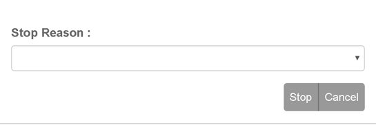
The input types can be customised by the developer depending on the plugin requirements.
Uses:
- List Selection
- Text Input
- File Select
- Action Confirm
Any plugin screen dialog will be able to use the .mobile-dialog attributes.
Classes
The .mobile-dialog class contain the classes specific to a Mobile Dialog Section.
.mobile-dialog {
/* Contains the Mobile Dialog Section looks classes unique for mobile devices */
    ...

    .dialog-label {
    /*
        Contains the label attributes unique to the Mobile Dialog Section
    */
        ...

    }
    .dialog-selector {
    /*
        Contains the selector attributes unique to the Mobile Dialog Section
    */
        ...

    }

    .dialog-btn-block {
    /*
        Contains the btn block attributes unique to the Dialog Mobile Section
    */
        ...

    }

    .dialog-action-btn-group {
    /*
        Contains the action button group attributes unique to the Dialog Mobile
        Section
    */
        ...

    }

    .dialog-action-btn {
    /*
        Contains the action button attributes unique to the Mobile Dialog Section
    */
        ...

    }
}
SCSS Files
The Mobile Dialog Section style classes are found in the
_mobile_dialog_section.scss.
The Mobile Dialog Section HTML layout classes are found in the
_mobile_dialog_section.web.scss.
The Mobile Dialog Section NativeScript layout classes are found in the
_mobile_dialog_section.ns.scss.
HTML
The Mobile Dialog Section uses Bootstraps Forms.
Refer to the Forms for more information about creating Forms using Bootstrap.
Below is the HTML code extract op-confirm.component shown in the image at the top of, Mobile Dialog Section:
<div class="mobile-dialog" [@dialogAnimation]="dialogAnimationState"
     (@dialogAnimation.done)="animationDone($event)">
    <div class="container-fluid">

        <div class="form-group">
            <div class="dialog-label"
                 for="operationDate">Operation Date / Time :
            </div>
            <input id="operationDate" class="dialog-selector form-control"
                   [(ngModel)]="inputData.operationDate" ng2-datetime-picker
                   close-on-select="false"
                   date-format="DD-MMM-YYYY HH:mm"/>

        </div>
        <div class="form-group">
            <div class="dialog-label text-muted">Request Further Instructions :
                <button class="dialog-action-btn btn-sm"
                        (click)="inputData.requestFurtherInstructions=!inputData.requestFurtherInstructions"
                        [class.btn-success]="inputData.requestFurtherInstructions"
                        type="button">{{inputData.requestFurtherInstructions ? "Yes" :
                    "No"}}
                </button>
            </div>
        </div>

        <!--BEGIN HANDBACK DIALOG -->
        <div class="btn-group pull-right">
            <Button class="dialog-action-btn" (click)="webConfirmClicked()">
                {{inputData.actionName}}
            </Button>

            <Button class="dialog-action-btn" (click)="cancelClicked(false)">Cancel
            </Button>
        </div>
    </div>
</div>
NativeScript
The Mobile Dialog Section uses the NativeScript recursive layout system.
The StackLayout defines the horizontal groups of GridLayout Content is placed in the GridLayout that is the immediate child of the StackLayout.
Refer to the ListPicker for more information about using NativeScript ListPicker.
Below is the NativeScript code extract op-confirm.component:
<StackLayout class="mobile-dialog">
    <StackLayout class="input-field" horizontalAlignment="stretch">

        <GridLayout rows="auto, auto" columns="auto, auto">
            <Label row="0" col="0" colspan="2"
                   class="dialog-label" text="Operation Date / Time :"></Label>
            <!--<GridLayout columns="*,*" rows="auto">-->
            <DatePicker class="dialog-selector" row="1" col="0" #datePicker
                        (loaded)="nsConfigureDate(datePicker)"
                        (dateChange)="nsDateChanged($event)">
            </DatePicker>
            <TimePicker class="dialog-selector" row="1" col="1" #timePicker
                        (loaded)="nsConfigureTime(timePicker)"
                        (timeChange)="nsTimeChanged($event)">

            </TimePicker>
        </GridLayout>

        <!--</GridLayout>-->

        <WrapLayout>
            <Label class="dialog-label"
                   text="Request Further Instructions : " textWrap="true"
            ></Label>
            <Switch #furtherInstruct
                    [checked]="inputData.requestFurtherInstructions"
                    (checkedChange)="inputData.requestFurtherInstructions = furtherInstruct.checked"
            ></Switch>
        </WrapLayout>
    </StackLayout>


    <GridLayout columns="*,*" rows="auto">
        <Button class="dialog-action-btn" col="0" [text]="inputData.actionName"
                (tap)="nsConfirmClicked()"></Button>
        <Button class="dialog-action-btn" col="1" text="Cancel"
                (tap)="cancelClicked(true)"></Button>
    </GridLayout>

</StackLayout>